Audio usability
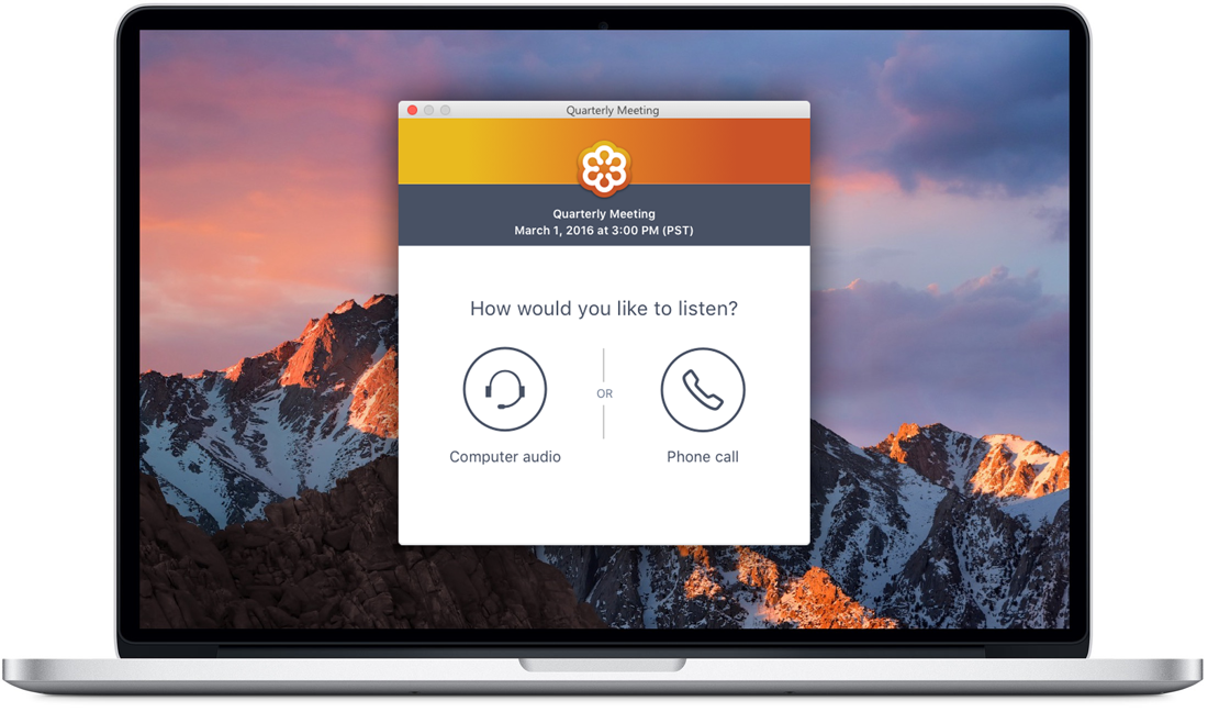
How would you like to listen to your meeting? A simple screen that has tested well for first-time users. Conversational phrasing and a single choice.
Audio issues can ruin online meetings. GoToMeeting, GoToWebinar and GoToTraining users encounter problems like echo when they join meetings if they connect to duplicate audio when joining a session. In this initiative, we sought to improve audio-related NPS (net promoter score) and reduce incidence of connection in two modes. Automatic audio connection was removed and a series of steps guides users through selecting their audio mode to connect. The User selects their microphone and speakers or dials a phone number, access code and PIN. Once they've completed audio setup, they connect to audio or see a message asking them to wait for the host to arrive.
Step by step audio onboarding
The design was shaped by design critiques, internal user tests, editorial reviews, feedback sessions from customer care agents, UserTesting.com tests, and customer office hours. Audio-related NPS saw an increase of 2-4 points. User feedback has been positive on the clarity of the steps. Challenges remain in supporting power users. Many ignore the checkbox and continue to click through the steps every time. The growing complexity between options (VoIP, toll-free, long-distance, Call Me) means that users have to click around to discover features they may miss. Some revenue-earning features are not as obvious or enticing.
Computer audio
Users who wish to connect to the meeting using their computer's mic and speakers follow this flow. They select computer audio, then see a "test your sound" page where they can select from a list of devices and use color bars to see if their audio is working. They can also play a test sound to make sure they can hear. These settings are remembered for next time and the user will skip over this dialog unless their device setup has changed.
Phone audio
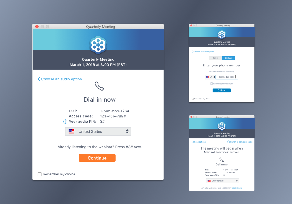
Some users prefer to dial into meetings by phone. After talking with users, we discovered that some feel more confident with phone audio because it is less likely to drop if the internet connection fails. Others simply like to walk around with their mobile device and stay connected to the meeting away from their computer. We discovered that inputting the phone numbers, access codes and PIN was especially difficult for users, so we made numbers large and clear and included # prompts so that users don't have to listen to spoken instructions alone.
USER RESEARCH
We conducted over 30 user interviews, 33 internal usability tests, and 60 remote usability tests on our audio interface in 2016. Customers shared with us their stories of difficulties when switching environments from their desk to a conference room, or how they struggled to coach their attendees to set up audio at the beginning of a meeting. We learned that users value large, clear instructions and step-by-step flows over all-in-one information overload.
"Kelly, can you hear us?" During user testing, we observed a participant attempting to speak in the meeting before confirming their audio selection. They believed that the green bars meant their microphone was connected to the meeting and they should be heard by others. In fact, they aren't yet connected and can't be heard by anyone. This led us to change the title of this dialog to "Test your sound."
A user plays the "test your sound" link to play music and test their speakers before joining the session. One of the concerns about the audio selection flow was the repetitive nature of seeing setup dialogs every time the user joins. We eliminated the first step for returning users so they would land on this page for returning joins. Eventually we were able to determine if any of their audio setup had changed, or if they didn't have more than one device to choose from, and they skipped this step before joining.
Design iterations
In this iteration, the user goes straight to the hallway to wait for the organizer with their preferred audio mode selected. If they want to change modes, they use the dropdown to either adjust their devices or select an alternate mode. This design had problems because the two audio modes are far apart from each other, so it's harder to discover. Also, this introduces a lot of complexity for a dropdown panel, and would require re-building the interface in a second place. Ultimately, a "back" link or tab pattern is the better pattern.
In this iteration, the user is presented with four choices instead of two. Call Me and Dial in are separated at the top level, and an audio-only mode is included at the bottom for silent viewing. This flow tested more or less the same as two options, with a little bit more cognitive work on the user's part. However, the problem came when introducing navigation for the returning user. Because links are used to navigate between modes and back to the beginning, this design would have required an overhaul of the existing flow in order to quickly jump between modes.
In this iteration, the user sees three options with a large button pattern, and then proceeds to the control panel for further instructions. The large button pattern becomes a similar shaped dropdown, allowing them to switch between modes and clearly see what mode they are in. No space is wasted exposing other modes and the pattern feels familiar between the out-of-session and in-session experience. Because of the amount of changes required to introduce this design, it was not feasible for development.
Project icon set. Icons were introduced into the control panel to give consistency between the new pre-session interface and the audio pane.
Typography style guidelines and color palette for the project. We moved away from pure black to a dark grey to help brand the dialogs and make the user feel welcome in their meeting.
Sketchbook
If a meeting is in progress, the user will see the meeting in the background and an audio mode selection dialog on top. Then, their selections will be reflected in the meeting control panel where they can make adjustments as needed.
Once the user enters the meeting, they must troubleshoot audio from a very small pane in the interface. Instead of a step-by-step flow, they see most audio options exposed at the top level. Helping the user recognize the audio pane and switch between modes if necessary was a challenge.
The audio flows use a variety of patterns control on/off/disabled states and the decision was made to move away from typical desktop UI patterns in favor of a larger "big button" pattern that appealed to users.


