25 webcam Meeting
GoToMeeting users have requested to see more of attendee webcams for years. In this project, we tackled viewing and managing up to 25 webcams in an online meeting. We uncovered use cases for filtering and hiding webcams depending on who was speaking or who was presenting. This feature released in GoToMeeting September 2017.
Customers told us how important it was to see their entire team, especially when distributed or remote. This is a photo of the team who built this feature.
Research & Design
I interviewed GoToMeeting users, conducted usability tests and icon surveys to create the final design for the webcam project. Before designing, I asked ten customers to co-create their ideal meeting layout with a collaging exercise to see what content they placed value on and how they expected to see it. With this knowledge, I built a variety of prototypes to simulate interactions for scrolling, paging, filtering, hiding, and re-positioning webcams in the GoToMeeting Viewer window.
User research January to June 2017
- 14 interviews
- 26 usability tests
- 34 survey respondants
a Customer's ideal meeting
A collage of an ideal meeting layout by a GoToMeeting customer.
explorations
Explorations of the relationship between webcams, screensharing and the control panel.
Layouts
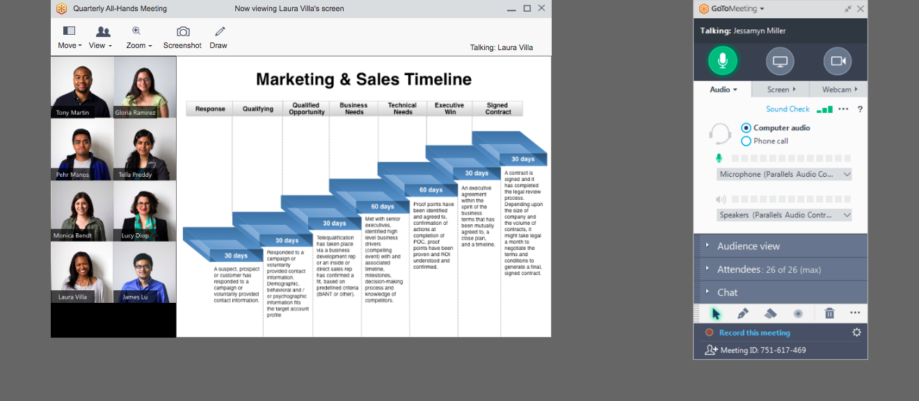
I explored a variety of layouts and interactions. My early assumption was that users would want to be able to configure the viewer in every which way. Later, I discovered that most users have a more hands-off experience with their meeting interface. They expect the interface to take care of laying out itself as meeting content and webcams come and go. It was up to me to determine the "smart default" that would satisfy most users, most of the time, and then build controls to handle additional use cases.
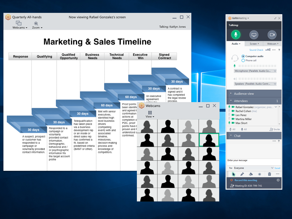
Screensharing and webcams in two windows
Webcams and screensharing split pane
Initial concept
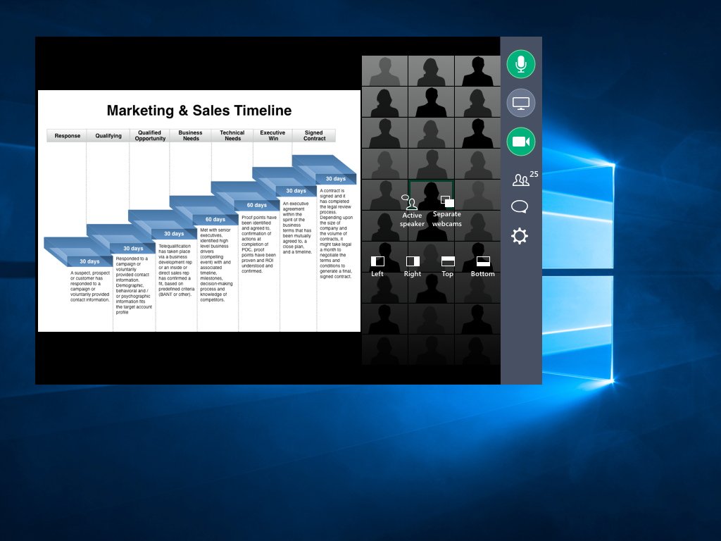
In this concept, I introduced a grid of 25 webcams into our existing Viewer and experimented with variations on using the title bar for commands. I discovered some of the complexities of managing windows within windows, and how to communicate to the user which controls belong to which content. I wrestled with how to expose controls, make them understandable and discoverable to the user, and at the same time maintain a sleek appearance. Using black and gray for the title bars and backgrounds helps the webcam feeds and screensharing content stand out from the background.
Icons
Using our existing icon library and color palette, I designed a series of icons for the GoToMeeting Viewer controls. We ran the icons through testing by surveying testers with the icons in context, with and without labels. We discovered problems with understanding in about half our icons when they weren't labeled.
Final
Final icon set created for GoToMeeting Viewer. These icons tested well again and again.
Not used
These icons tested poorly, or the overall concept wasn't clear. These icons were not used in the final design.
icon survey
We tested icons with and without labels to see if both the image and the text made sense.
Prototypes
I prototyped a variety of designs to experiment with the users' tolerance of icons, terms, and hidden, contextual or offset controls. These experiments allowed me to carry out about 3-5 interactions in a user test before I hit a limit of functionality. I used Sketch to create the illustrations, then Axure and InVision for the interactions. Users interacted with the prototypes during conversational interviews and in remote usability sessions via UserTesting.com
Drag and drop
Drag and drop was the solution I was sure would be the answer to our customers problems. It wasn't. Drag and drop tested well, but in the end few customers were interested in repositioning their webcams.
Ribbon menu
The menus at top tested well with some, while others overlooked them completely and instead clicked on the webcams or screensharing content looking for buttons.
Carousel
Paging or sliding through the webcams was a common request. But when we showed them a prototype of this, they said, "nah, I'd rather just see everyone."
Separate windows
Undock webcams. In this prototype, the user undocks webcams, and then presumably they take this window and drag it over to another monitor. It looked good in theory but tested poorly in real life.
Buttons on hover
Buttons on hover. In this prototype, we eliminated a toolbar and showed all the commands as buttons on hover. Many users struggled with this because it was difficult to read and make out the details. Others were completely blind to it, and didn't notice it even when they moved their mouse over it.
Picture in picture
Picture in picture. We got positive feedback on the idea of a picture-in-picture view of webcams and screensharing, but in real life the webcam overlapped important screensharing content and annoyed testers.
solution
We couldn't get every piece of the proposed design out in the first release. We decided to focus on the most important pieces with the greatest impact. We kept the existing top-menu style and aligned the Mac and Windows Viewer design, which had been out of sync for quite awhile. We labeled icons and focused on the webcam filters over other configurations, since customers expressed more interest in those than other types of controls, such as re-positioning the webcams left, right, top or bottom.
We also re-worded and adapted the behavior of the "undock webcams" command after it tested poorly in our internal testing sessions. We had overlooked the possibility that the command was shown to people with one screen and multiple screens, even though it was designed to solve the problem of showing two types of content on two screens. We hid the command from those with one screen, and changed the name from "undock webcams" to "use two screens" in order to make it clear what the option did. In addition, instead of relying on the user to manually move and resize the webcam window, we automatically positioned it full-frame on the second monitor.
GoToMeeting defaults to the gallery view, so that attendees "just see everyone. Customers expressed how important it was to them to see their team.
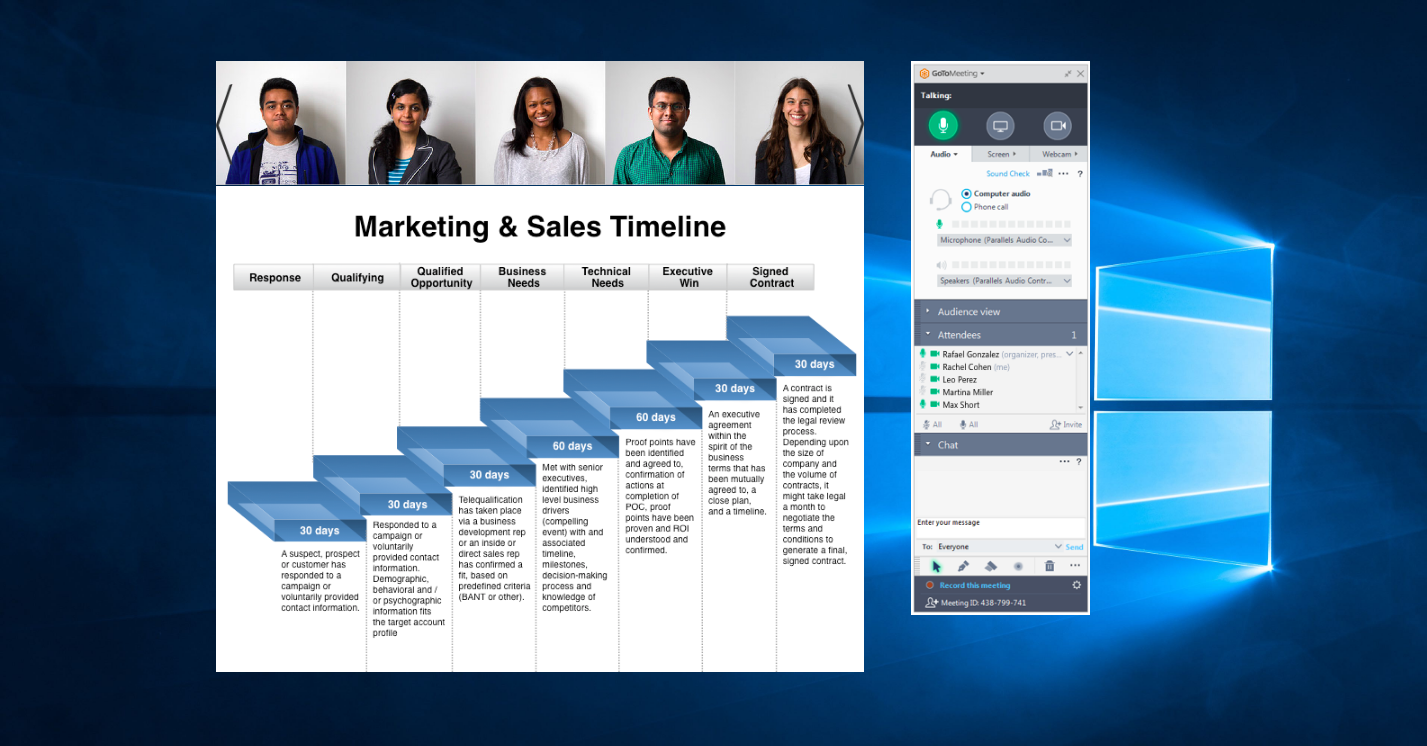
The final viewer for Windows desktop. We changed the default to see webcams across the top, which met users' expectations and allowed their gaze to stay close to their webcam. Few users expressed the desire to move their webcams to any other position.
The final Viewer for Mac desktop, showing the "Use two screens" button.
Use two screens allows the user to show webcams on one monitor and screensharing on the other. Helpful for conference rooms and users with two monitors.
I'm thrilled to see customers using this feature for their own team meetings. Our goal is to help remote teams work together and build relationships to do their best work.
Delighted to see happy customers using the feature to bring their teams together. Picture from Twitter, Oct. 17, 2017 @garybentley


